The Art of Printmaking:
Silk Screen Printing
Silk Screen Printing
The past 6 month I have been practising the art of Silk Screen Printing. Below you will find some of the more successful project I have been working on and a bit of the proccess behind them. It has been av very exciting experience and a fun time learning this beautiful and messy artform!
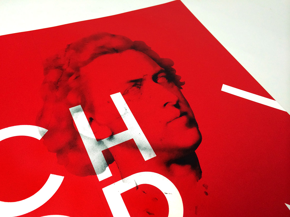
Frederic Chopin
The project below was assigned as a project to create a poster for a famous person. We got to chose our famous person out of a hat, and I was very excited to draw out the famous pianist Frederic Chopin!
The project below was assigned as a project to create a poster for a famous person. We got to chose our famous person out of a hat, and I was very excited to draw out the famous pianist Frederic Chopin!
Note: all of the projects below are fictional projects, and not for any real clients.

Pouring the first layer of red ink onto my screen. Exciting and a little scary to do these large, flat surfaces, and to get the color even and flat while at the same time getting the letterforms crisp and clean!

Red ink came out nice and crisp, very satisfied!

Next layer consisted of a half-tone bitmap of a marbel looking bust of Frederic Chopin

The white type bellow the half-tone image of Frederic Chopin is actually not knocked out like the big letterforms are, they were printed lastly with white ink on top of the solid red. It was a challenge to get the white ink opaque enough to make it look just as white as the lagre letters, but with a good mix of plenty of white ink and the right base, I managed to make them just as chrisp and white as the huge letterforms
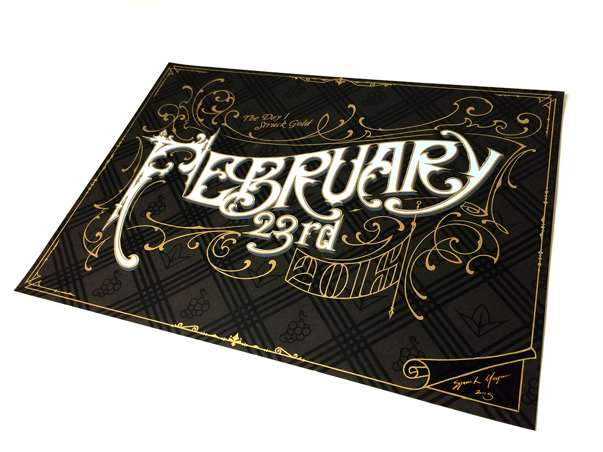
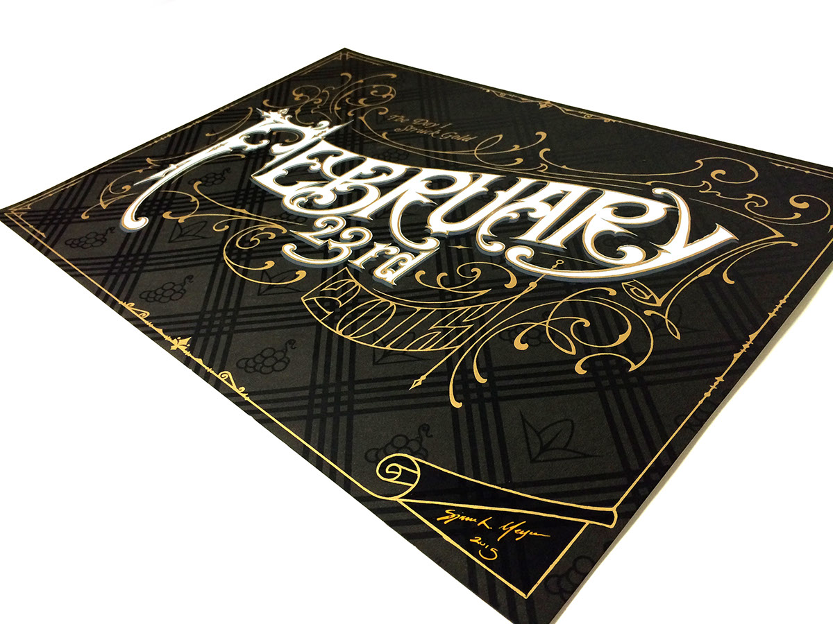
February 23rd
This next project was very exciting one, and the one I definetly spent the most time on. The project was to select a date spechial to us, and create a poster out of it. The date I chose was to me a very spechial one. February 23rd was the date I got my first internship as a designer, at my most favorite design agency in the entire world, Stranger & Stranger! I thought it be fitting to do some hand lettering for this project, and I was also looking forward to trying out gold ink for the first time.
Now, the proccess of drawing up the lettering on frosted mylar, that wold later become the gold layer outlining everything. The drawing was made with a Sharpie Paint, giving off completely opaque strokes that could then be made into a plate for my screen.


Here comes the dirty, but very exciting part of finishing it all off with a gold layer. The finished print itself consists of 6 layers in total.


Color Theory
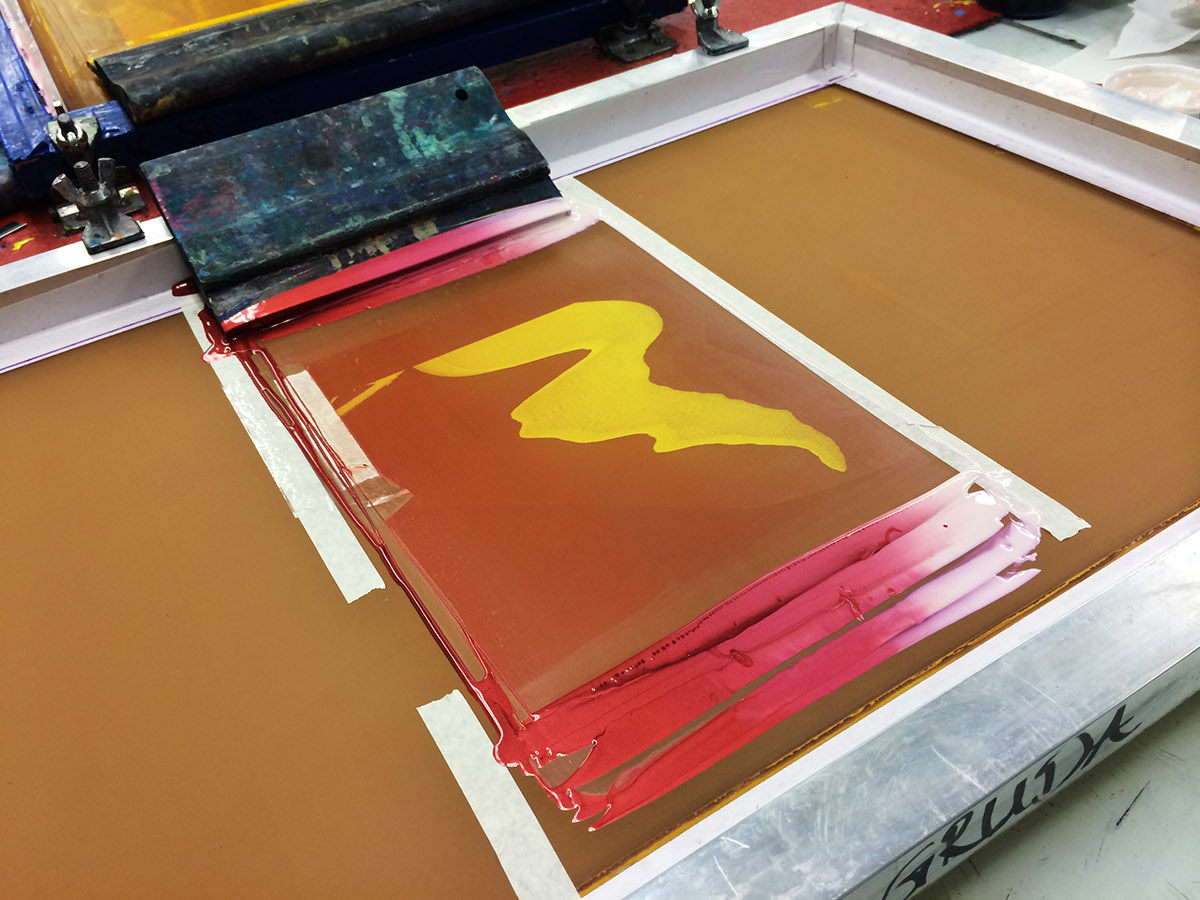
This last project was a very tricky one as well. It involved both gold ink as well as two blending colors of metallic ink, and here one needs to be especially specific during the printing proccess to be sure the right elements ends up at their at its exact locations.

Below is the digital sketch up for the project. This would serve as the plan for the printing process.

The project originally was to create a three-or-more poster line up, but that we would eventually only print one of the posters. Below is the complete design
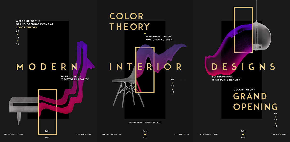


Here is the blending of the fire-red metallic ink with the violet metallic ink. The spechial violet ink appears white or "see-through" unless printed on a black surface.
At the end of the process here, finishing up with all the white type. Previous tryouts lying on the side.

End resault lying to dry


I've found Silk Screen Printing to be a very exciting world of art and design, and it is something I hope to do much more of in the future.
Thank you for watching!

